
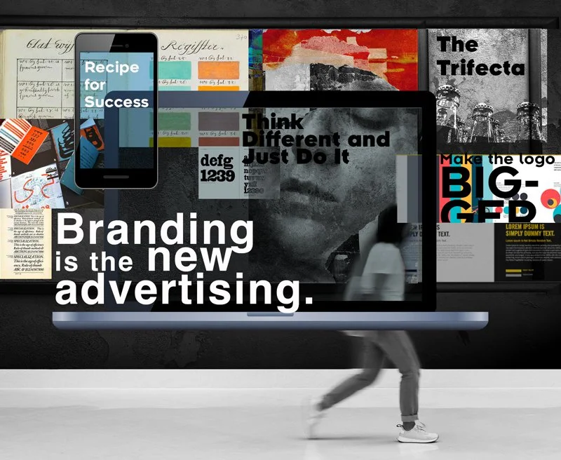
Branding is the new advertising
Branding is the consistent thread that weaves through the fabric of omni and multi channels.
It builds relationships by using a unique and relatable visual and verbal voice that resonates and creates an emotional bond with the right customer, at the right time, and on the right platform.
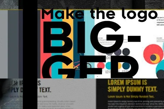
“Make the logo bigger!”
We’ve all heard that, and even said it a few times in our careers. But a logo alone is not a brand. It’s a critical component, and you can’t expect it to do the heavy lifting.
Paul Rand used to say, “A logo doesn’t directly sell, it identifies.” If that’s the case, brand guidelines are the description of the brand as a unique entity with a distinctive verbal and visual lexicon. It consists of color combinations, fonts, image styles, illustration styles, and a vocabulary that defines the brand persona. This palette paints a portrait that is woven through every touchpoint your customer has with your brand—whether it’s interactive, print, grassroots, events, or social. It further reaches into the internal corporate framework such as customer service, sales, and the company’s manifesto and ethos.
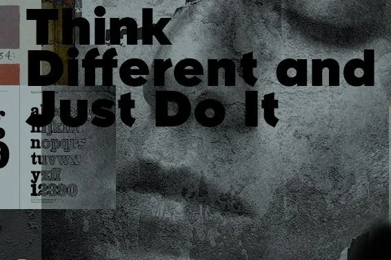
Think Different and Just Do It
Apple and Nike have become ubiquitous branding paragons in brand communications and architecture—they sell the ideology and culture of the brand before the product. And, that ideology’s prompt is the logo that is supported by a distinctive visual and verbal voice spanning all channels of communication—a foundational support system on which all tactics are built.
For Nike, it’s Just do it. For Apple, it is Think Different. These are more than taglines. These are battle cries, mottos, that not only correspond to an ad or a webpage, but are the very ethos of their corporate culture and product development.
Apple’s 1984 credo of breaking the paradigm of right-brain thinking is visible in the Think Different campaign and especially the Mac/PC commercials with the two actors personifying the brands. That’s the ultimate brand voice.
As for Nike, whether it’s Colin Kaepernick or Serena, the attitude of the JUST DO IT battle cry (on the court, on the field, or in a protest march) is ever present, the Nike check mark ticking off the activity.
And, let’s not forget Intel, whose branding is simply a sound.
Ad campaigns change, but a brand structure is the compass that remains consistent, pointing to the true north: the brand’s essence. Nike’s ads are the direct result of a very thoughtful and mindful holistic system. It ensures the emotion and messaging is consistent and easily recognizable even without the logo on any platform.
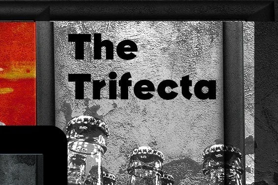
The Trifecta
At ACOMPANY.NYC, we not only create style guides, we also work with them, and they fall into 3 specific categories: the anemic, the tome, and finally the ideal—the hybrid.
The Anemic
A 3-page style guide that only specifies color palette, fonts, and logo usage is not a rounded portrayal of a brand as it can’t possibly explain the “why” of the choices made, nor paint an adequate portrait of a brand for a designer who needs to execute an ad, a website, or a convention panel.
Firstly, a brand cannot own a typeface, unless the font is a custom creation. For example, Pentagram created a bespoke letterform for the New School called Neue. However, most companies will not have the resources for a custom font. So, the guidelines have to work harder to identify why Helvetica (a typeface that is omnipresent in our daily lives from packaging to signage) is used.
Color generates emotions: red for passion, blue for pragmatism, yellow for optimism. The color wheel along with Jungian archetypes, is a great blueprint for translating character traits into corresponding colors. Although it’s about as scientific as astrology, it’s still a valuable tool and a wonderful discussion springboard during workshops. This is why it is integral to explain why a brand uses the specific colors—because contrary to popular belief, designers also read.
For designers, words become colors, fonts, and especially images. The feelings from a manifesto inspire. Nike’s manifesto of Just Do It translated into visuals such as the You Can’t Stop Us split screen of pro athletes in multiple sports, decked out in Nike gear. On the other side of the spectrum is Find Your Greatness, a story of a kid just doing it. There are no quintessential graphic elements until the very last 5 seconds. Yet it is distinctively Nike. There is no big ass logo, it’s the full brand style guide extended to not only tell a story but to create an emotion—the drama, the sacrifice, the hard work of “just doing it.” I still get goosebumps every time I watch these ads.
So not to invest in a style guide that is fleshed out to tell a brand story is doing the brand a disservice, because a logo is just the beginning of the conversation—making it bigger will not amplify recognition. It will just make the logo big, and make things like headlines and images small.
The Tome
Granular, prescriptive, almost litigious style guides that are as lengthy as they are boring snuff out any creativity. Yes, boring. Knowing your audience is key. Style guides are used and read by creatives, so direction and inspiration should go hand in hand. A creative’s job is to color outside the lines—to come up with innovative solutions. When we’re boxed in—or worse, bored or uninspired—that is when we shut off and go on autopilot. This leads to generic creative that will not do a brand justice.
We once worked with a brand that wasn’t very complex, but very corporate. It had some swooshy arches (which are omnipresent in the pharma space) a specific photo style, and the mandatory logo/font/color specification. However, it had brand guidelines with over 200 pages, and that was just for the visuals!
These guidelines not only included a laboriously lengthy section of don’ts, but also showcased grids for any and all conceivable deliverables in every size and shape. It was a full-time job to navigate the guide, and the overabundant server that housed the templates. I think flying an airplane might’ve had easier instructions. Conversely, there wasn’t a single page devoted to the brand persona, value proposition, or a manifesto. Nothing to get the creative juices going or understand why the arches or the color palette were selected. There was absolutely no room to get out of the template box.
However, our client tasked us with creating something original for her sub-brand. We scratched our heads at first, but ultimately delivered a concept that used the rigid brand system in conjunction with a unique visual idea that focused on the end benefit.
Our approach was shut down by the brand committee, because they felt the visual idea was outside the parameters of their guidelines.
What we ended up delivering was a generic concept that looked exactly like the template. There was no brand voice or relationship building; it was a swoosh with a generic image and a headline.
Ultimately, a swoosh is not branding: the emotion and story behind the swoosh are what’s ownable and what sells.
The Hybrid
The preferred style guide is a hybrid middle, which instructs as it inspires, drawing a line between mandatories and exploration, and explains why that line is drawn.
Giving up the logo and brand guide that you create can be difficult. It’s your brain baby. But it does need to get out into the world, and other designers and copywriters will have to use it to create their brain babies.
We worked with a brand guideline that has become our compass when we create branding. We can’t show it here as it’s a proprietary document, but it was created by the talented folks at Landor for a large corporation.
From the cover to the pages inside, we felt like someone gave us a coloring book with a pack of crayons and set us loose. We were free to explore shapes, color combinations—we were free to play. And, that play was based on a directional guideline with key objectives that were fun to read, and a manifesto that was as sincere as it was articulate and eloquent.
The whole guidebook was beautiful to look at. Its layout was our guide to how a design should look, not a turnkey template. We woke up in the morning eager to get to work. We understood that we were given a precious gift—someone wanted us to do what we do: be creative, invent, have fun, do something awesome.
The end product was a success. The client loved what we accomplished. The inspiration showed in our work.
Since then, we incorporated that thinking into a few style guides of our own.
We had to create something that the in-house team could take and deploy. It was a guide based on a lengthy branding workshop and process that delivered messaging and visuals for B2B and consumer audiences. But the thread was adoration for chocolate. We delivered Colorform-type elements with chocolicious imagery, and a lexicon that could be used for social posts and marketing materials. We omitted the word delicious, and used delectable, luscious, luxurious, crave-worthy as a part of the vocabulary.
The event was a huge success. The groundwork and research prompted a guideline that not only articulated the adoration of all things chocolate, but also provided the insights of where and when to reach the customer — 4pm and midnight, when chocolate cravings strike!
The logo, a monogram of the company name, has a strong presence while the ruby color is a way to “own the female,” and both work in tandem to communicate the ethos of the company: strong, fierce, independent, and confidently female. It is also an extension of the owner’s personality.
The photography is inclusive and will never show a selfie, because the people represented by the company don’t have time for them—they’re too busy changing the world. This is yet another nod to the manifesto and the company’s client base: change-makers for a better world.
Recipe for Success
So, when developing a brand or a brand guideline, don’t think of it as a done-and-gone job, or just a few hours spent on a logo. Think of it as a recipe composed of many ingredients, each adding to the flavor profile. It is directional inspiration for another designer or copywriter to cook up a storm for social, events, websites, videos, and ads.
Ultimately, that’s how you forge a relationship between the entity of a brand and your customer, and create an emotional connection that’s not generic but unique and ownable and has a consistent presence on any channel.
Here are some other brand guidelines that are droolworthy:
UBER
The original guideline was an interactive play land. They currently updated their brand look but this one is a classic, because it showed tech innovation not just said it.
https://www.behance.net/gallery/27578519/Uber-Brand-Guidelines
NASA
Created in the 1970s it has outlasted time and is as visual relevant now as it was then.
https://standardsmanual.com/products/nasa-graphics-standards-manual
SLACK
The representation of their friendly and approachable archetype is articulated from the cover to the illustration style. The online media kit extends the ease of use end benefit.